




[Qareeb] - 🇩🇿
Qareeb – A Tech Brand Rooted in Precision, Power, and Progress
Project Summary
Qareeb is more than just a name it's a symbol of proximity, performance, and precision. Our mission was to translate the technical depth of a software solutions provider into a modern, minimal, and meaning-rich brand identity.
A Logo Built on Purpose
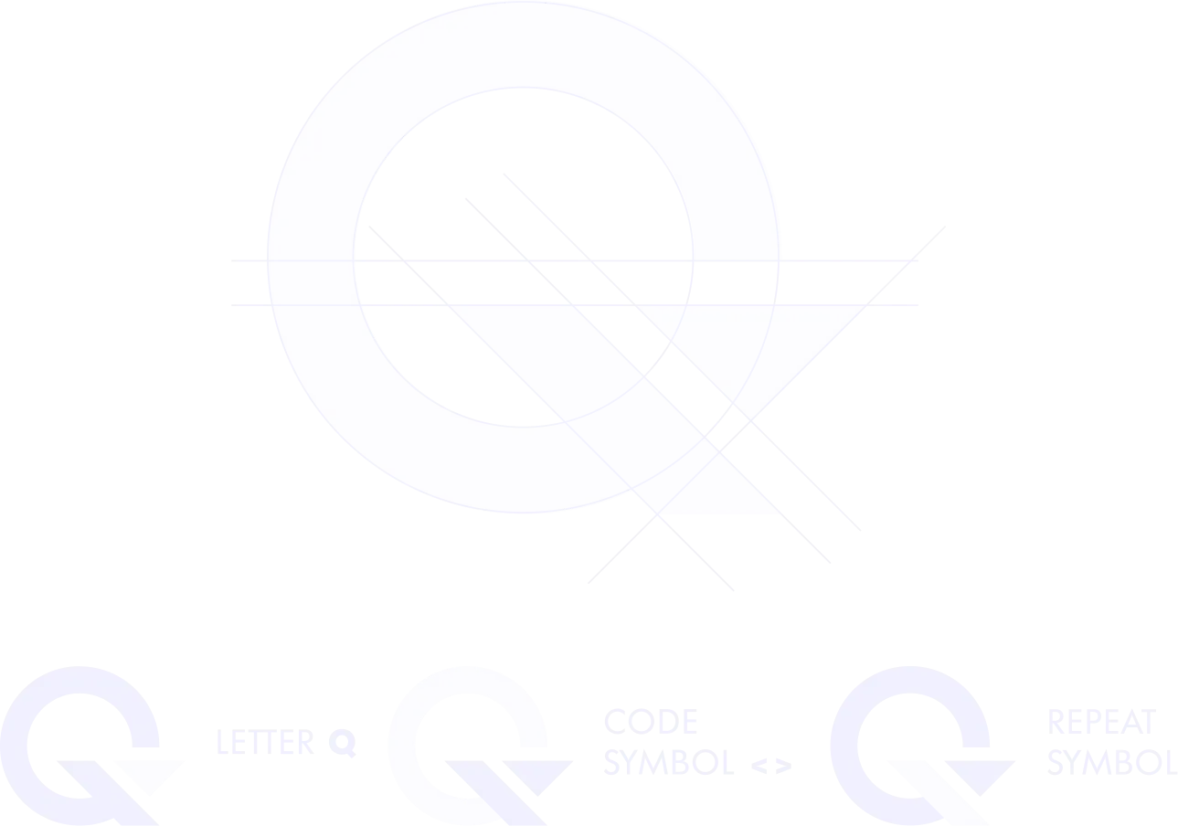
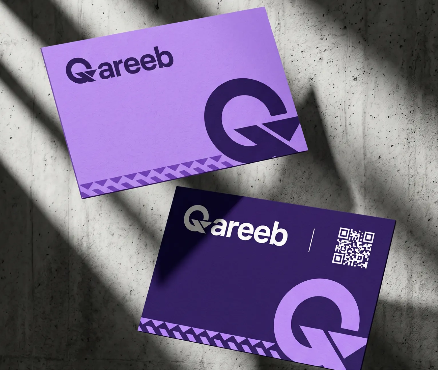
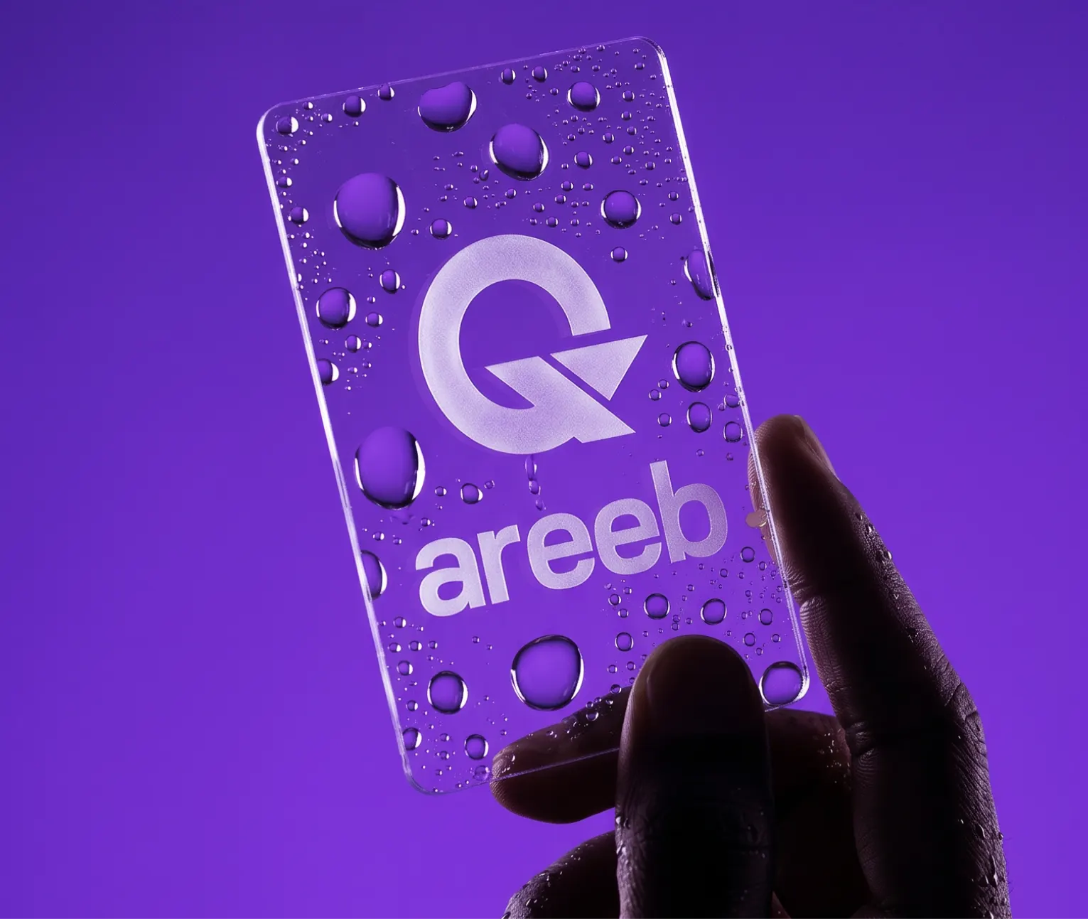
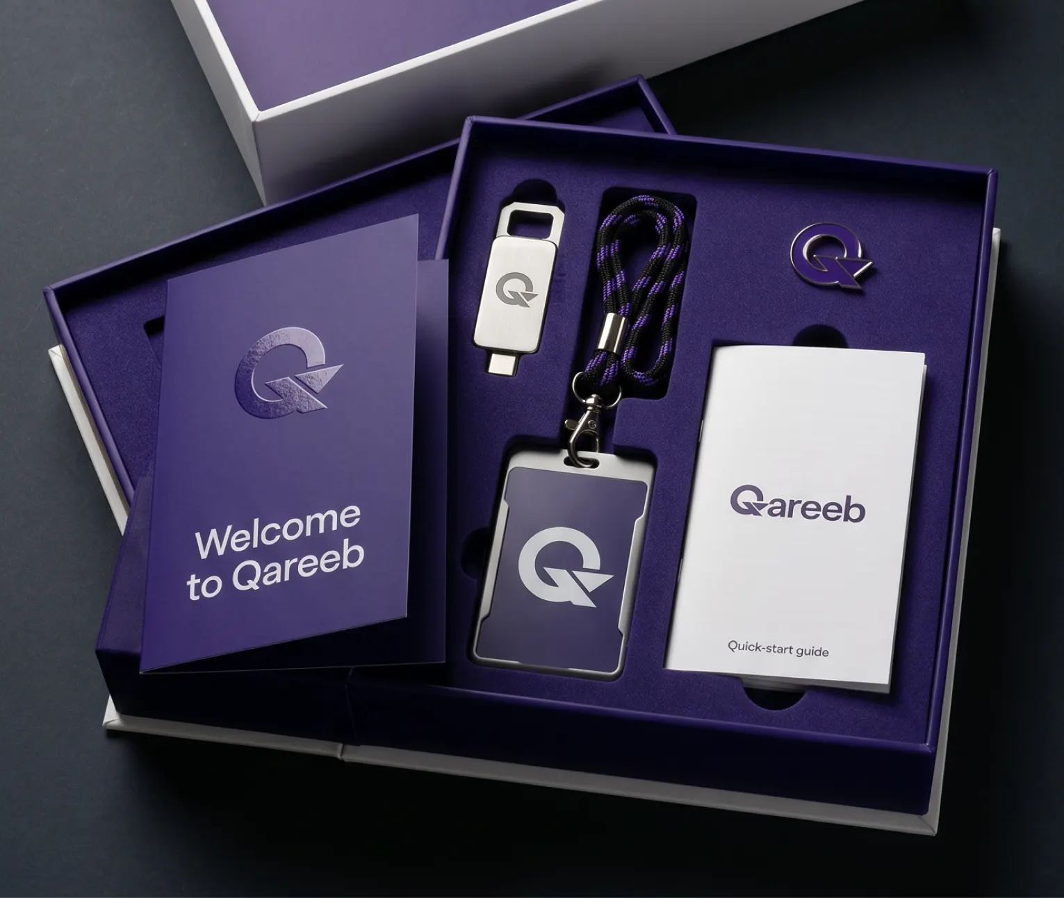
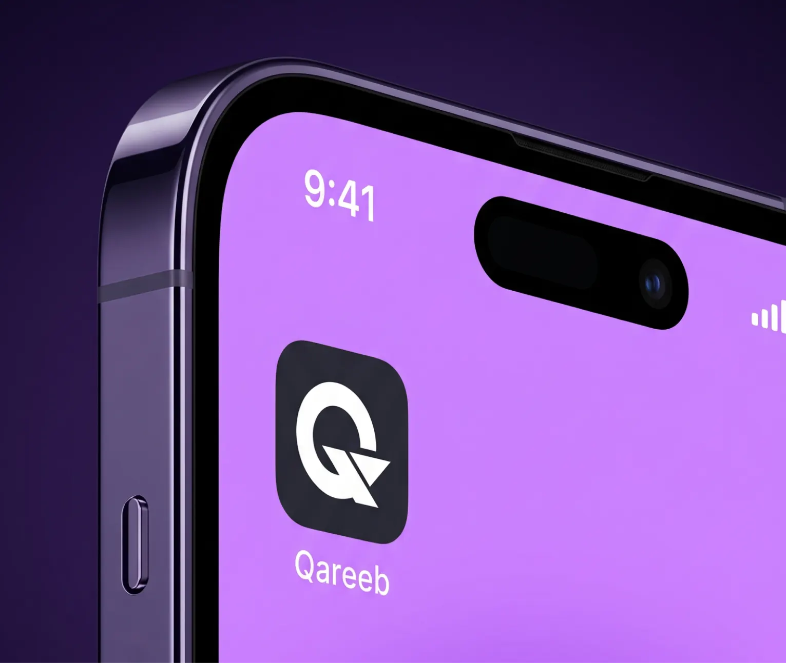
At the core of Qareeb's identity lies the letter Q, integrated with coding and repetition symbols. Every visual element serves a function:
The structure reflects clarity, control, and a high-tech spirit perfect for a digital partner offering AI-integrated software solutions.

Crafting Trust Through Innovation
We designed Qareeb's communication strategy to speak directly to fast-scaling tech companies. Using bold typography and strong headlines, we introduced core value propositions like:
This not only reflects the product's capabilities but elevates the company's image to a partner not just a service provider.

✦ Still scrolling?
[Allo Oui]
Let's Build
✦ Together
Have questions? Ready to start your project? Or just want to say hi? We're here to listen and help you grow.
